
 By Elson Correia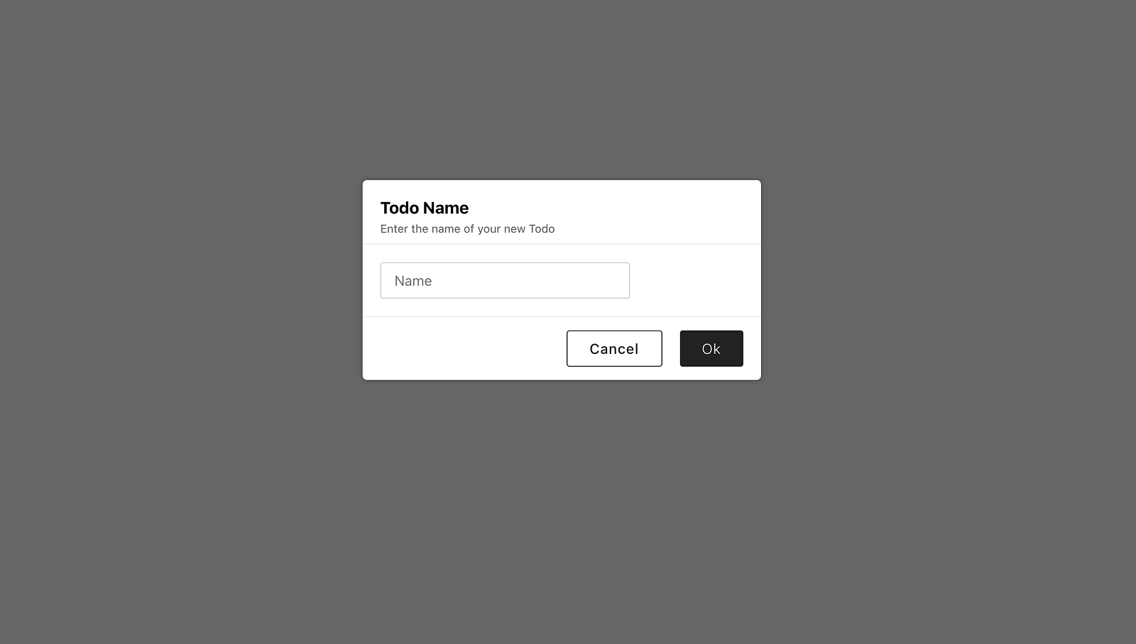
Modals and Dialogs are ways you can focus users on a specific thing you want them to act upon. They are industry standard and super common in every application you visit. As a frontend engineer, knowing how to put one together is an essential skill and super easy to do.
Modal
A modal should be as flexible as possible. It should be possible to compose a modal of any type and size. Some with no footer header. Should be mindful of the vertical and horizontal view of real estate and more.
To start let's define the overall modal container.
import {ReactNode, SyntheticEvent} from "react";
import ‘./modal.scss’;
import {currentModal} from "./current-modal";

interface ModalProps {
 id?: string;
 children: ReactNode;
 onClickOut: () => void;
}

export const Modal = ({children, onClickOut, id = "modal", ...otherProps}: ModalProps) => {

 const handleOutsideClick = (e: SyntheticEvent<HTMLDivElement>) => {
  if (typeof onClickOut === "function" && (e.target as Element).className === "modal-container") {
   onClickOut();
  }
 }

 return (
  <div className="modal-container" onClick={handleOutsideClick}>
   <dialog {...otherProps} id={id} className="modal">
    {children}
   </dialog>
  </div>
 )
}
- props: the modal takes 3 props. The
id, a callback for click out, and the children node to render inside. Then it spread any possible propsotherPropson the dialog tag. - dialog tag is used as the semantic HTML for Modal and Dialogs. It by default renders on top of all other page content.
- handle click outside: the dialog tag is modal. The
modal-containeris the background that will fill the view. If the click happened in the background is because someone clicked outside the modal. In that case, we call the outside click callback if it is a function. - Background style: the background needs to be in a fixed position and fill the entire view with a semi-transparent dark background to prevent help users focus on the modal. You may also blur it to make it hard to see what's behind it. I also added a slight fade so the modal does not appear too suddenly for the user.
// the view covering background
.modal-container {
 position: fixed;
 z-index: 100; // high above all content
 left: 0;
 top: 0;
 width: 100vw; // fill the view horizontally
 height: 100vh; // fill the view vertically
 background: rgba(0,0,0,0.6); // transparent dark background
 animation: fade-bg 0.3s ease;
}

// make the background fade in
@keyframes fade-bg {
 0% {
  background: rgba(0,0,0,0)
 }
 100% {
  background: rgba(0,0,0,0.6)
 }
}
- Modal style: I used the dialog HTML tag style as much as possible. I turned it into a column with display flex, white background, rounded corners, and some mild shadow. Important here to pay attention to dimension so I limit its height to 80% of the vertical view real estate and 450 pixels wide. For animation I made it slide up and appear so it's smooth to the eyes.
.modal {
 display: flex;
 flex-direction: column;
 background: #fff;
 border-radius: 5px;
 box-shadow: 0 0 5px var(--grey-8);
 padding: 0;
 width: 450px;
 max-height: 80vh; // limit how tall the modal can be
 margin-top: 25vh; // make the modal stay closer to the top of the view
 border: none;
 animation: slide-appear 0.35s ease;
}

// make the modal fade up and reveal
@keyframes slide-appear {
 0% {
  opacity: 0;
  transform: translate(0, 35px);
 }
 100% {
  opacity: 1;
  transform: translate(0);
 }
}
Modal Content
The content is a very simple container that should be scrollable in case the modal contains too much content. Besides that, it's pretty simple.
import {ReactNode} from "react";
import './modal-content.scss';

interface ModalContentProps {
 children: ReactNode;
}

export const ModalContent = ({children}: ModalContentProps) => {
 return (
  <div className="modal-content">
   {children}
  </div>
 )
}
For the styling, I made it so it scrolls when there is too much content. This is taking into consideration that the modal itself has a max height of 80% of the vertical view. A 20 pixels padding makes so the content stays away from the edges of the modal.
.modal-content {
 padding: 20px;
 overflow: auto;
}
Modal Header
The modal header is also very simple. For this example I allow a title and description to be provided where the title can be an element of your choice so there is full control of what shows at the top.
import {ReactNode} from "react";
import './modal-header.scss';

interface ModalHeaderProps {
 title: ReactNode;
 description?: string;
}

export const ModalHeader = ({title, description}: ModalHeaderProps) => {
 return (
  <header className="modal-header">
   {typeof title === "string"
      ? <h3 className="modal-title">{title}</h3>
      : title
   }
   {description && <p>{description}</p>}
  </header>
 )
}
For the style, it's a column so the title and description appear stacked with a bottom border and even side padding. The title has a small bottom spacing and the description a slightly grey text where the first letter is capitalized.
.modal-header {
 display: flex;
 flex-direction: column;
 padding: 20px 20px 10px;
 border-bottom: 1px solid var(--grey-2);

 .modal-title {
  margin: 0 0 5px;
 }

 p {
  margin: 0;
  font-size: 0.8rem;
  color: var(--grey-7);

  &::first-letter {
   text-transform: capitalize;
  }
 }
}
Modal Footer
The footer is probably the simplest component accepting only what to render inside the footer HTML tag.
import {ReactNode} from "react";
import './modal-footer.scss';

interface ModalFooterProps {
 children: ReactNode;
}

export const ModalFooter = ({children}: ModalFooterProps) => {
 return (
  <footer className="modal-footer">
   {children}
  </footer>
 )
}
For the styling, however, I made it so all its content will align on the right — assuming it will only contain action buttons. Added a nice 20 pixels in between them. Like the header, a border, and even side spacing.
.modal-footer {
 display: flex;
 padding: 15px 20px;
 justify-content: flex-end;
 border-top: 1px solid var(--grey-2);
 gap: 20px;
}
Usage
Now let’s look at how we can use all of these components to compose a custom modal or dialog for us.
For this example, I'm creating a dialog that displays a text field to collect some value.
const TextFieldModal = ({
  title,
  description,
  placeholder,
  onSubmit,
  onCancel,
  saveLabel = "ok"
}: TextFieldModalProps) => {
 const [value, setValue] = useState('');

 const handleSubmit = () => {
  onSubmit(value);
 }

 return (
  <Modal
    id="text-field-modal"
    data-testid="text-field-modal"
    onClickOut={onCancel}>
   <ModalHeader
      title={title}
      description={description}
      ></ModalHeader>
   <ModalContent>
    <TextField
      value={value}
      onChange={setValue}
      placeholder={placeholder}/>
   </ModalContent>
   <ModalFooter>
    <Button
      onClick={onCancel}
      variant="outline">
      Cancel
    </Button>
    <Button
      onClick={handleSubmit}>
     {saveLabel}
    </Button>
   </ModalFooter>
  </Modal>
 )
}
And this is what it looks like at the end.

modal appearing on click on blank background and disappearing on click outside
The styling of your modal totally depends on your UI system and preferences but it's recommended to be consistent and make all the default style parts of the modal and let the customizable parts to be decided when composing the modal.
Perhaps you want a modal with no header or footer. Perhaps you want to show an x close button or some fancy UI on the header. All that should be possible with this simple modal. Enjoy!
What Next?
I recommend you invest time in some Modal Renderer to lazy render all your modals from anywhere in your app dynamically. I wrote the post “How to Handle Modals In A Large-Scale React App — Render Manager” which you can check to learn how.
How to Handle Modals In A Large-Scale React App — Render Manager *Modals, Dialogs, Notifications, and Snackbars, are all examples of “global components” — as I call them. These are…*medium.com
YouTube Channel: Before Semicolon Website: beforesemicolon.com