
 By Elson Correia
Many situations call for custom form elements, which can be easily created with web components. The problem is that wrapping an already-known form element does not automatically make it work with forms.
There are many things that web forms do for us that we probably dont stop to think about:
- Form reset: When a form is reset all its elements automatically clear their values in response;
- Form submit: When a form is submitted, you can create a FormData instance by providing the form element, from which you can read each form element value as long as it has a name attribute.
- Form validation: Each form element keeps a valid state based on many different attribute types and values (pattern, required, etc). This valid state can easily be checked at the element or form level including by the browser to show proper errors to users.
- Form autocomplete: Browsers can remember values and use them to autofill form elements. Each of these form elements needs to be able to accept these values as if the user inputs them.
The last thing you want is to create custom form elements that do not comply with these rules. They can make a huge difference in the developer and user experience. We need to create better forms and that means creating better customizations.
Now let me show you how to do that.
class TextField extends WebComponent {
    // define the attributes the component should react to
    static observedAttributes = [
        'value',
        'placeholder',
        'pattern',
        'disabled',
        'required',
        'error',
    ]

    // define attributes default values
    placeholder = ''
    value = ''
    pattern = ''
    required = false
    disabled = false
    error = 'Invalid field value.'

    handleChange = (value) => {
        this.value = value
        // dispatch a change event with the input field value
        this.dispatch('change', { value })
    }

    // render the component content
    render() {
        const { error, ...inputAttrs } = this.props

        return html`
            <input
                ${inputAttrs}
                part="text-input"
                type="text"
                ref="input"
                onchange="${(event) => this.handleChange(event.target.value)}"
            />
        `
    }
}

// add your web component to the customElements registry
customElements.define('text-field', TextField)
The above is a custom text field component that I want to create. It takes some known HTML input attributes and an additional error message when the input is invalid.
This creates the field but it still needs to work with forms!
Let me explain.
<form id="sample-form">
    <text-field
        placeholder="Enter first name"
        name="firstName"
        pattern="[a-z]+"
        error="Invalid first name. May only contain letters and no space."
    ></text-field>
    <text-field
        placeholder="Enter last name"
        name="lastName"
        pattern="[a-z\s]+"
        error="Invalid last name. May only contain letters separated by space."
    ></text-field>
    <button type="reset">reset</button>
    <button type="submit">submit</button>
</form>
I can use it in a form but I need to meet the requirements before this can be useful.
<!-- add a onsubmit event handler -->
<form id="sample-form" onsubmit="handleSubmit(event)">...</form>
If I introduce a form submit handler to read its values, I can see that the form does not see my custom text field.
// catch the submit event and read the form data
function handleSubmit(event) {
    event.preventDefault()

    const formData = new FormData(event.target)

    // log form entries and fields of the form
    console.log(Object.fromEntries(formData), [...event.target])
}
The above console log outputs the following:
{} (2) [button, button]
…and this tells me that the form only sees the two buttons.
Form Association
The first improvement I need to make is to mark my component as a form-associated element by setting the formAssociated static property to ‘true’.
class TextField extends WebComponent {
    ...

    // mark the component as form associated
    static formAssociated = true;

    ...
}
With this, the form sees my custom form element.
{} (4) [text-field, text-field, button, button]
Internals
When using the Markup WebComponent it exposes the internals property which gives us the ElementInternals instance of the element. If you are using native web component APIs, you can get that by calling the attachInternals method on every HTMLElement instance.
#internals;

constructor() {
  super();
  this.#internals = this.attachInternals();
}
The value of the field will change and when that happens we need to continue to update the internal form value so that on submission the form will have the latest value.
To do that, I'll add a change event listener handler
class TextField extends WebComponent {
    ...

    handleChange = (value, report = true) => {
        this.internals.setFormValue(value);
        this.value = value;

        const [inputField] = this.refs['input'];

        const validity = inputField.validity
        this.internals.setValidity(validity, validity.valid ? undefined : this.props.error(), inputField);
        report && this.internals.reportValidity();

        this.dispatch('change', {value});
    }

    ...
}
We do a lot of things here so let me break it down:
- I start by calling the
setFormValueand provide the updated value; - I also update the
valueproperty in case it is read from the element instance; - I then grab a reference of our HTML input element and collect its
validityvalue. It could be that your custom form element does not wrap a native form element which in that case, you need to calculate the validity based on the value. - I can then call the
setValidityof our field by providing a boolean, and an optional error message but only when it's not valid. - I follow by reporting the validity by calling the
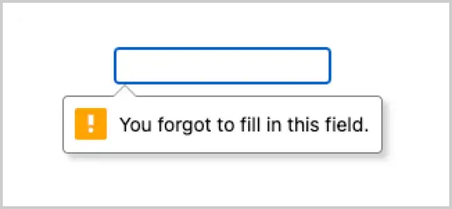
reportValidityand this is what triggers the browser to show a popover on top of the field. I only do that if thereportvalue provided to the change handler is true — you will understand it later.
- We conclude by dispatching a change event to any listener attached to our custom field and providing the new value.
With this, we ensure that whenever the form, browser, or any code, reads our custom field, they will always have the latest value and validity status.
Form lifecycles
Our custom form elements can also react to many events that happen around and at the form level they are in. We can do that by tapping into the form lifecycles and adding code that sets our element up, update, or tear it down.
formAssociatedCallback
The formAssociatedCallback is called when our element is mounted inside a form. We can use it to do our initial element setup.
For this example, I will just report the initial value via internals just in case the element is first rendered with a value.
class TextField extends WebComponent {
    ...

    formAssociatedCallback(form) {
        this.handleChange(this.props.value(), false)
    }

    ...
}
Here I chose to not report validity by passing false to the report argument on the handleChange . This is just a choice of mine, nothing you should follow unless you need it.
formDisabledCallback
The formDisabledCallback is called in 2 situations:
- A
disabledattribute is added/removed on our field; - A
disabledattribute is added/removed on a fieldset the component is inside of.
For our example, we will use it to update our internal disabled property that automatically updates our input field.
class TextField extends WebComponent {
    ...

    formDisabledCallback(disabled) {
        this.disabled = disabled;
    }

    ...
}
formResetCallback
The formResetCallback is called when the form is reset. In our example, this happens when the user clicks the “reset” button but it can also happen if we call the reset method on the form element.
We can use it to clear the value by setting our component value to an empty string, and call the handleChange so the internals value and validity are updated and the new value is dispatched.
class TextField extends WebComponent {
    ...

    formResetCallback(form) {
        this.handleChange('', false)
    }

    ...
}
formStateRestoreCallback
The formStateRestoreCallback is called:
- When the browser restores the state of the element (for example, after a navigation, or when the browser restarts). The mode argument is “restore” in this case.
- When the browser’s input-assist features such as form auto-filling setting a value. The mode argument is “autocomplete” in this case.
We can use this in our TextField example to grab the value the form was restored with to update the form value and validity of our component.
class TextField extends WebComponent {
    ...

    formStateRestoreCallback(state, mode) {
        if (mode == 'restore') {
            // expects a state parameter in the form 'controlMode/value'
            const [controlMode, value] = state.split('/');
            this.handleChange(value, false)
        }
    }

    ...
}
This will ensure our field can also be autofilled.
Full code
You can take a look at our full TextField component using Markup WebComponent including the simple style.
You can also play with it in CodePen.
class TextField extends WebComponent {
    static observedAttributes = [
        'value',
        'placeholder',
        'disabled',
        'pattern',
        'error',
        'required',
    ]
    static formAssociated = true

    stylesheet = `
        input {
          border: 1px solid #444;
          padding: 8px 10px;
          border-radius: 3px;
          min-width: 150px;
        }

        input:user-valid {
          border-color: #090;
        }

        input:user-invalid {
          border-color: #900;
        }

        input:disabled {
          opacity: 0.5;
          cursor: not-allowed;
        }
    `

    placeholder = ''
    value = ''
    pattern = ''
    disabled = false
    required = false
    error = 'Invalid field value'

    formAssociatedCallback(form) {
        this.handleChange(this.props.value(), false)
    }

    formDisabledCallback(disabled) {
        this.disabled = disabled
    }

    formResetCallback() {
        this.handleChange('', false)
    }

    formStateRestoreCallback(state, mode) {
        if (mode == 'restore') {
            const [controlMode, value] = state.split('/')
            this.handleChange(value, false)
        }
    }

    handleChange = (value, report = true) => {
        this.internals.setFormValue(value)
        this.value = value;

        const [inputField] = this.refs['input'];

        const validity = inputField.validity
        this.internals.setValidity(
            validity,
            validity.valid ? undefined : this.props.error(),
            inputField
        )
        report && this.internals.reportValidity()

        this.dispatch('change', { value })
    }

    render() {
        const {error, ...inputAttrs} = this.props;

        return html`
            <input
                ${inputAttrs}
                part="text-input"
                type="text"
                ref="input"
                onchange="${(event) => this.handleChange(event.target.value)}"
            />
        `
    }
}

customElements.define('text-field', TextField)
Take away
We can create truly advanced forms by leveraging custom form controls and creating elements that fit our needs and not be limited by HTML, and we can do all that without sacrificing developer or user experience.
I used Markup WebComponent which makes creating web components super simple. Everything related to form controls you saw above are just as they are natively. Form controls are not a feature of the library I use.
To learn about Markup WebComponent, you can read an article I wrote:
Reactive Web Components Are Here *I love web components! Even better now with all the improvements they received over the last few years. However, there…*medium.com