, , and tags. Find strategies that allow you to efficiently render CSS but don’t adopt any extreme measure like adding id or class to everything for styling purposes unless you are using a class utility first library or really need that extra performance. For a better idea, try to learn about how CSS works.
#main-navigation
body #page-wrap
.main-navigation
li a.nav-link
nav ul li a
*
[disabled]
8 — Avoid inline styles
The only thing that can overwrite an inline style is the usage of !important flag and as you will read on the next block, the !important flag can be bad and inline styles call for it.
Another reason to avoid them is that you added an external stylesheet for a reason and that reason is to separate style from the structure(HTML). There are exceptions to this but if you have a style in your external stylesheets, style in HTML, or style in Javascript, it becomes hard to track what is doing the change and as the codebase grows, it becomes hard to maintain.
Some libraries and frameworks like Svelte and Vue allow for HTML(JSX), CSS, and Javascript to coexist in the same file but at the end of the day, it really comes down to preference.
9 — Avoid !important
If you are using Bootstrap and really want to overwrite a style, you will need to use the !important flag but again, why are you using Bootstrap in the first place?
If you find yourself feeling the need to use the !important flag it is normally a sign you have a problem. You may be using a hard-to-overwrite third-party library; You are using inline styles; You are being overly specific with your selectors; You have a CSS hierarchy or order problem or should try to understand how CSS specificity is calculated.
10 — Write CSS consistently
Consistency is key. Even if you are doing everything wrong, remain consistent as it will be easier to fix them later. Find a naming convention that works for you, adopt a CSS methodology, organize styles the same way, define how many levels you nest selectors, etc. Define your style and stick to it and improve it over time.
11 — Use a design system
A design system allows you to build for the future because it allows you to define your general design rules and specifications, follow an organization, modularize, define best practices, etc. The reason it is a future-proof strategy is that it is much easier to introduce changes, and fix and configure things on a global scale.
12 — Prefer shorthand
Sometimes you want to specify the padding-top or border-right but from experience, I often come back to these to add more so I adopt the habit to always use the shorthand to make it easier to change without specifying many properties. It is easier to change and it is less code.
13 — Combine common styles
Avoid repeating styles by grouping selectors with the same style rules. You can comma separate selectors with the same style body.
14 — Turn common tricks into utility classes
If you find yourself applying tricks or the same styles over and over again, turn them into class utils to be used directly on the HTML tag. For me, these are things like center with display flex or grid so I create a class .center-flex and .center-grid. Create class utilities to automate these repetitive style combinations.
15 — Use relative units more
You should really try to use relative units more. Things like em, rem, %, vw, vh, fr, etc. Setting fix values with px and pt should be things for static design although there are cases that call for these value units. The browser is flexible, and so should your website and units.
16 — Be aware of expensive properties
The browsers are super fast now but from time to time, on complex websites, I see some painting issues related to setting box-shadow, border-radius, position, filter, and even width and height, especially for complex animations or repetitive changes. These require the browser to do complex re-calculations and repaint the view again down to every nested child.
17 — Minimize layout modification styles
Layout modifiers are properties like width, height, left, top, margin, order, etc. These are more expensive to animate and perform changes since they require the browser to recalculate the layout and all the descendants of the elements receiving the change. It starts to become more evident when you are making changes to a lot of these properties at once so, be aware of that.
18 — Use “will-change” as a last resort
The “will-change” is used as a performance boost to tell the browser about how a property is expected to change. The browser then does complex calculations before it is used and although this sounds like a good thing, more often than not, you don’t need it. Unless you find performance issues related to things changing like when transforming or animating something, use is a last resort.
19 — Comment your CSS
Commenting is a good thing, adopt it! If you write complex hacks or found those cases where something works but don’t know why then add a comment. Add comments for complex things, organize your CSS, help others understand your thinking and strategy, and to make sense of your mess when you come back to it later.
20 — Normalize or Reset your CSS
Every browser comes with a default style for the elements and these vary, therefore, there is a chance that your thing may look one way in one browser, and different in another, and it may have an extra border or shape you were not expecting. By resetting or normalizing your CSS you streamline these things and give your style a better chance to look the same in any browser.
21 — Consider a better font-loading strategy
You can continue to use @font-face to define your fonts but use the tag to load your fonts so you are able to defer them especially if you have more than 1 font file. You should also look into SVG fonts and learn about them as they allow for a more accurate font rendering. Add your @font-face rules at the top of your stylesheet.
22 — Avoid too many font files
Maybe the designers handed you too many font files which is a red flag. A website with too many fonts can be chaotic and confusing so, always make sure you are including the fonts you will need for the page. Fonts can take time to load and be applied and when you have too many fonts your UI normally jumps into place after the fonts are loaded.
23 — Minimize CSS
Before you load your CSS into the browser, minimize it. You can use a post-processor or make it a simple build process step of your site deployment. Smaller CSS files will load faster and start to be processed sooner.
24 — Use CSS variables
My #1 reason to use a pre-processor was the variables and CSS variables are way better because they stick around when loaded in the browser. The support is good and it allows you to create a more flexible and reusable UI, without mentioning it helps you create a more powerful design system and features.
25 — Don’t remove the outline property, style it!
Don’t set the outline property to “none”, instead, style it! If you don't like how it looks, style it to match your website's look and feel. For people navigating your website with a keyboard or some other screen reading navigation method, the outline is crucial in letting them track where they are.
26 — Don’t introduce a CSS library/Framework unnecessarily
Nowadays the first thing most people do is add a CSS library or framework and it can be a costly decision in the long run sometimes. Normally these people come across something they don't know how to do and therefore bring an entire library to help.
Adding a CSS library should be a careful consideration. Don't add one unless you have the intention of using most of its features, you and the team are comfortable with the decision and it will indeed help decrease delivery time and debugging time considerably. If you bring one in, take the time to learn it and use it fully. If you often find yourself overwriting or hacking a third-party library, you don't need it!
27 — Use double quotes
Whenever you include any string value like background or font URL or content, prefer double quotes and keep it consistent. A lot of people leave quotes out which can work sometimes but may cause problems with CSS parsing tools. Also, look into CSS quotes property to automate some of these.
28 — Avoid hard-to-maintain hacks
Whenever you introduce a hack to your style, it is best to put it in a separate file to make it easier to maintain, for example, hacks.css. As your codebase grows it becomes hard to find them and address them, overall, try to avoid hacks altogether if possible.
29 — Format Text with CSS
CSS can format your HTML text. No need to manually write all caps, all lower or capitalized words in your HTML. Changing a CSS property value is way faster to change than going around changing all the text in HTML, and it is also better for internationalization as it allows you to write the text as you want and manipulates how it looks with CSS.
30 — Validate CSS
W3 organization provides a free CSS validator you can use to make sure your CSS follows general guidelines for correct CSS style rules and guidelines.
31 — Style to be responsive or at least fluid
You are creating something to go in the browser which means that people will access it in a variety of device types and sizes. Really consider improving the experience for these people by considering fluid or responsive design. If your project does not include a responsiveness plan, try to at least remain fluid.
32 — Let the content define the size
Instead of setting the width and height of a button, for example, consider setting some padding for spacing and including a max-width instead and max-height instead unless the design calls for a strict size.
33 — Follow a CSS methodology
CSS methodologies will ensure consistency and future-proof your styles. There are a few options to try or you can even adopt multiple.
- BEM (Block Element Modifier) — This is a powerful methodology intended to separate block (components) vs elements (component parts) and modifiers (component and element states) using a class naming convention.
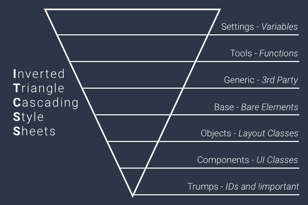
- ITCSS (Inverted Triangle CSS) — a very powerful way to organize things by their level of specificity based on 3 principles: Generic to explicit, low to high specificity, and far-reaching to localized style rules.
- OOCSS (Object Oriented CSS) — a really nice method intended to separate and abstract independent snippets for reusability following the common object-oriented paradigm in your CSS.
34 — Avoid constantly overwriting/undoing style
A huge red flag is one that you write a CSS style and then somewhere else you write the same CSS with different values, pretty much-overwriting everything. If you are constantly doing this, there is clearly something wrong with the way you are approaching styling your project.
You should almost never fall into a situation where you need to overwrite your own styles. It shows that you have style variations and you probably did not plan your UI beforehand.
35 — Add animation declarations last
Another thing you can do is put your animation @keyframes in a separate file and include it at the end of your stylesheet or simply import it last. This will ensure your entire style is read before the browser tries to perform any of the animations on load.
36 — Don't mix third-party CSS overwrites with yours
Whenever you write a style to overwrite a third-party library, consider putting it in a separate file for easy tracking and maintainability. If you decide to get rid of the library later, it will be easier to remove them, and putting them in their own file is already self-documentation.
37 — Specify the properties you need to transition for
When you are specifying transition, always include all the names of properties you intend to transition. Using the “all” or leaving the property name out will force the browser to try to transition everything and affect the transition performance.
38 — Avoid using id attributes everywhere
Maybe you are one of the crazy ones who desperately want every bit of performance out of your CSS, otherwise, using id everywhere can be bad. Id attributes styles are hard to overwrite, and are meant to be unique per page so follow these guidelines for id usage:
- Use it for something truly unique on the page like a logo and containers;
- Don’t use it on or inside components that are meant to be re-used;
- Use it on headings and sections of the website you want to link to;
- Use an id generator to ensure uniqueness if necessary;
39 — Be aware of the styles order
CSS stands for Cascading StyleSheets which means that whatever comes last has the potential to overwrite previous styles so order your styles in an order that ensures that the style you want will be applied. It is all about understanding your way around CSS specificity.
40 — Lint your style
Linting works by ensuring you follow the rules you define for your style and make sure your styles are consistent, well structured, and follow CSS best practices. Look into Stylelint and how to set up style linting in your favorite IDE and how to set up your configuration file.
41 — Alphabetize CSS properties
It makes it easier to find things and you can even use Stylelint to enforce this rule.
42 — Box size border-box everything
The CSS property box-sizing default value should be border-box and it is listed as one of many CSS API mistakes. At the top level simply declare *, *::after, *::before{box-sizing: border-box;}.
43 — Avoid color names
Prefer to specify your color values with hex and color functions instead of saying red, purple, or cyan. There are millions of hex color values and no name for all of them. For consistency's sake, find one way to add colors and stick to it.
44 — Let the parent take care of spacing, position, and sizing
When styling a component meant to be used in the content flow, let the content and inner spacing define the size and do not include things like position and margin. Let the container where this component will be used to decide the position and how far apart this component is from others.
45 — Try to organize CSS to match the Markup Order
It sure makes for an easier way to understand your markup just by looking at your CSS. It is something I do and saves me a lot of time.
46 — Keep HTML semantics and use CSS for styling
It is common to find developers who go around changing their HTML in order to apply a certain style. In general, let the styling to CSS and let your HTML structured in a way that makes sense semantically. There are exceptions to this rule but always ensure that the adopted structure does not go against any HTML semantic rules. Write your HTML first with content in mind, not styling. Then add CSS and try your best before changing your HTML for styling reasons.
47 — Hyphens or underscore?
The most common separator for class and id names is a hyphen but whatever you pick, stick to it.
48 — Find a CSS solution before you reach for Javascript Help
I keep sharing how to build common components using CSS only as much as possible in my Youtube UI/UX library and what I want you to understand is that you should try to find a CSS solution (something not too hacky) before you try to add Javascript and even when you add Javascript, consider having CSS doing the most of the styling and using Javascript for things like triggers and side effects.
49 — Remove Unused CSS
For the same reason, you should ship the only CSS you will use, consider using tools like PurgeCSS to remove CSS that will not be needed in rendering. These tools will look at your CSS and HTML to determine which styles you will need. If you are not sure you need this, consider using browser tools that look for your code coverage which will tell you whether you are shipping unused style or not.
50 — Use a PostProcessor
Really consider adding PostCSS to your project so you can utilize a variety of plugins to optimize your CSS like Autoprefixer(add webkit-, moz-, ms-, etc ), CSSNano (minimize your CSS), postcss-preset-css (allows you to write future CSS), and so many others that can help you define standards and rules, introduce tools, class utilities, communicate with javascript and standardize many of these best practices you just read about.
Conclusion
No one will start writing better CSS overnight, it takes practice and tuning. These have helped me a lot in my CSS journey and I am sure they will help you too. Every experience is unique and you should keep an open mind in order to try things until they feel right for you.
Don’t be afraid to adopt tools to help you but also don’t be too eager to jump into something just because everybody is doing so. There is an art level in understanding, writing, and organizing CSS. Whatever the rules you end up adopting, remain consistent.
You can watch me code CSS on the Before Semicolon YouTube channel, feel free to read more of my stuff and reach out for help.
Good luck!
Next Read Recommendations:
50 Javascript Best Practice Rules to Write Better Code
15 CSS Things to Master and Become a Better Web Developer

YouTube Channel: Before Semicolon
Website: beforesemicolon.com

 By Elson Correia